Drumroll, Please! | New Branding for Perfect Salt Studio, Salem Oregon
It was time: after nearly 10 years in operation and helping countless clients find their brand identity and logo design, we needed a new branding "face-lift" for Perfect Salt Studio! Full warning: this post contains (probably) an excessive amount of exclamation points, and a lot of insight into my approach as a graphic designer.
This sweet business adventure has changed a lot over the last few years (from solely working on graphic/paper design to specializing in small business marketing materials, photography and special-event paper goods). With all this change, I thought it was a great time to share another set of changes: new logo, new colors...new branding EVERYTHING!
Read on to learn more about the Perfect Salt studio branding and design process, see the final designs...and get a special offer!
How it started:
As a photographer and artist, I find that certain images repeatedly draw my attention. I looked through my most-loved Pinterest boards, and the images from my own work that continually pull me back to looking at them.
When looking over these inspiration pieces, I looked for commonality (in how the image made me feel, what elements were similar, etc.), and noticed a few things:
- I am drawn to colors with muted hues! While I really love to play with bright colors, the images that really captured my heart were a little softer, but still colorful.
- Blush-y pinks, soft, slate-y blues and greens were common in the color palettes that I love.
- The images had a combination of modern and vintage/soft elements. I'm drawn to images with some sort of curve to them, and most featured circle or soft elliptical shapes.
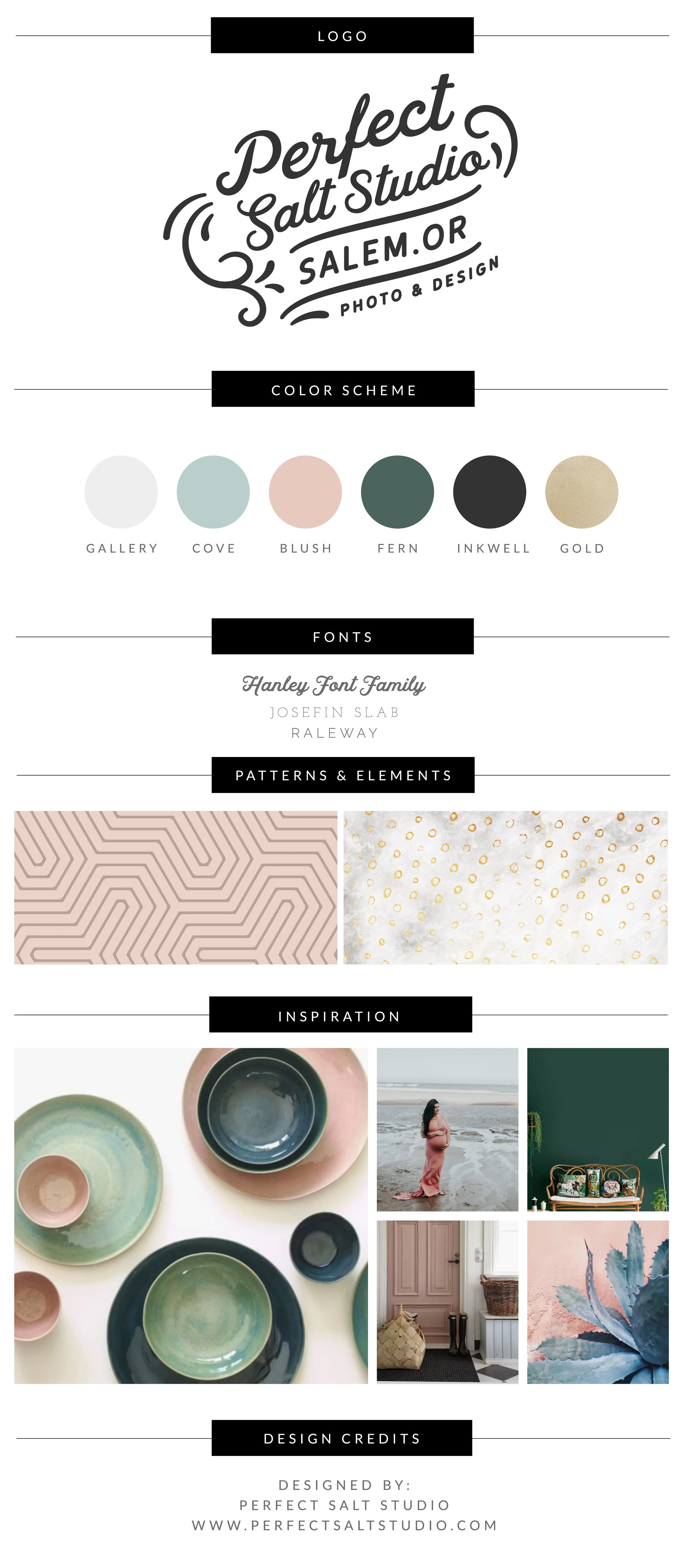
From here, it was time to develop a custom color palette that reflected this love of muted hues, pinks, blues and greens!
Choosing a Color Palette

When choosing my color palette, I let my inspiration pieces guide me. As you can see in the examples above, I like a lot of pinks, deep greens and sea-inspired colors.
And (those who know me well will confirm)...I kinda REALLY love shiny elements...especially gold! So even though it didn't show up in my palette initially, I knew I wanted to include it. I love how the Gold and Inkwell black combine with the other soft colors to provide some dynamic structure to the color palette!
With all my clients, we usually choose between four and six colors in a custom color palette, with the first three being the primary branding colors (you'll see a lot of Gallery, Cove and Blush throughout my site and new branding!), with the last three being used as accents or details throughout the branding process.
After choosing the perfect color palette, it was on to one of my favorite steps: playing with letters and choosing the perfect font pairing!
Choosing the perfect font pairing
Friends and family tease me because I am always noticing different fonts/lettering combinations (and apparently, commenting on them constantly!). To choose the perfect fonts, I looked through my inspiration boards and other logos that I loved, and (one more time!) looked for commonality.
Here is what I noticed:
- Lots of the logos I love have a combination of vintage (or vintage inspired) display fonts, mixed with a clean, modern type for the secondary fonts.
- I LOVE fonts that include a slightly "curly" element: fun swashes, cursive or handwriting inspired elements, all with looking clean and neat.
- When I design websites, I love using Josefin Slab and Raleway. I knew that in my redesign, I would need to be incorporating these for my own web fonts! They are also a great choice because they are widely available in a lot of design platforms.
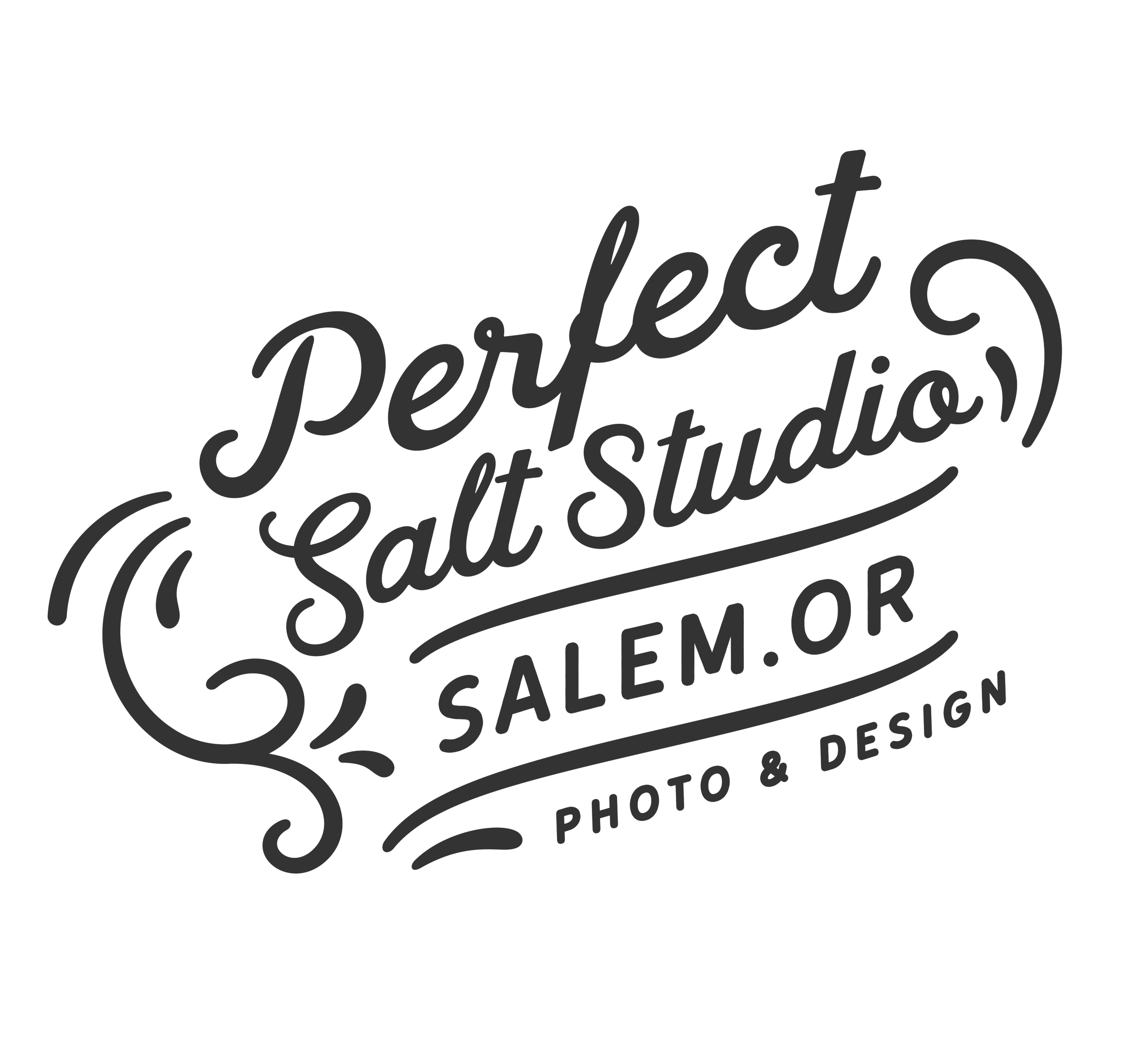
The final decision: Hanley Font Family for the primary font, with Josefin Slab and Raleway as supporting/secondary fonts.
Now it was on to my absolute FAVORITE part: designing a custom logo!
Creating the Perfect Salt Logo

Creating a logo that communicated my vision hasn't always been an easy concept for me to wrap my brain around (and is one reason I empathize with clients who are struggling with being decisive when it comes to their own logos!). Logos communicate a lot about your brand, and are usually one of the first things that potential clients see about your work...it can be nerve-wracking to decide what kind of first impression you want to make!
Here are some things I needed my logo and brand to communicate:
- A classic (but modern) feel. Nothing too trendy, but not too "plain-Jane" either.
- I needed a place to let folks know that the studio really focuses on photography AND graphic design.
- I love my home state of Oregon, and want folks to know that the PNW is a huge part of my life/background/design inspiration. There has been a big push amongst creatives and business owners in my area to help Salem through it's own "rebranding" as a place that people CAN (and will!) find a vibrant, creative culture and enthusiastic entrepreneurs.
- The main words I kept thinking about for my logo and branding "feel" were: clean, vintage-inspired, text-centered (I didn't want a lot of pictures or symbols in my logo, just really keeping the focus on simple lines and the featured text).
- I wanted my clients to to know me as creative, simple, modern, fun.
Every client I work with goes through a full branding questionnaire that helps them identify all the same elements I described above. It's important to know who you are, what you want your clients to know, and what your style is when working on your logo! I used the same questionnaire in my process (it really helps take some of the mystery out of the process, even if you've been doing this for awhile!).
Including aLL THE SWEET DETAILS

One of the most common questions I get from my own design clients is about the custom patterns and elements part of our design process.
While clients TOTALLY don't have to include these, they can be SO helpful when making marketing and web materials! Think about your brochures, packaging materials (boxes, stickers, custom tape, address labels, etc.), web banners, business cards, album designs...the list goes on for so long!
While I don't use a lot of little illustrated elements (again, my brand focused on less of these illustrated elements), I DEFINITELY had a need for some easy go-to patterns for marketing materials and packaging.
The two options you see below are used in a variety of ways, and each have their own color variations (the geometric first pattern can also be found in white and Inkwell black, while the gold-circle pattern also graces the "Fern" color from my palette above).
The Takeaway & your opportunity to refresh for spring!
First: thanks for making it this far in the post! I really appreciate your time. Read on to find a special "thank you" gift from me for checking out the post and Perfect Salt!
Going through the branding process for myself was a great way to revisit the process and define what was important to me as a small business owner. It allows me to make purchasing and branding decisions that are true to MY business, not the latest trend or what I think would be cool in the moment.
Looking to refresh your brand? LET'S DO IT!
Engaging in my own re-brand has renewed my passion for helping small business owners and creatives share their businesses with their clients, and I can't wait to get started helping you!